Text Placement on Curves in Cartographic Rendering
• • •
Text Placement on Curves?
Concretely, how does it work?
This is a recurring problem in cartography.
With the development of GIS and the growing amount of available data, it is natural to want an automatic tool to name streets, rivers and all types of curves, but not at the expense of readability or graphic quality.
From your data, LorikGISMapper offers a wide range of geomatic processing, styling, and finally text placement tools that put the finishing touch on your maps.
This article focuses on text on curve placement, but the software also offers placement of so-called “flat” texts (flat labels), which we will cover in another article.
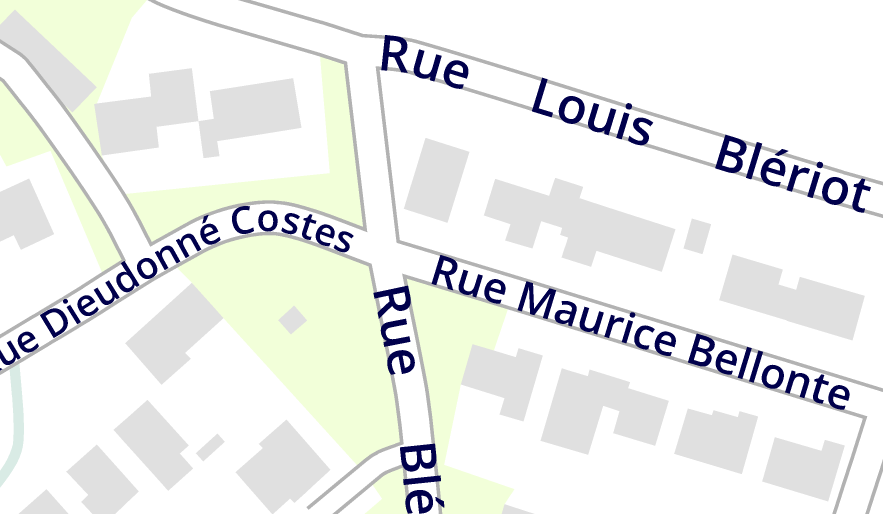
What is a readable text on curve?
Placing a text on a curve may seem simple, but the varied shapes of curves, the complexity of the network, the density of texts, the obstacles to the text such as symbols or flat texts, the relevance and importance of the information are all constraints that need to be taken into account.
Lorienne has been developing a range of cartographic editing software for a long time, and through the analysis of production, surveys, and feedback from our clients, which include some of the largest publishers, we have been able to formalize this.
Let’s quickly go over obvious notions like size and orientation to focus on the point that is certainly the most important:
Distribution
Word Spacing.
What is acceptable:
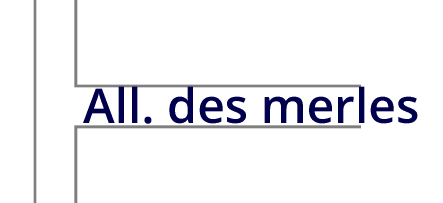
As in a text editor, a space between words is the standard, but a larger gap remains valid::
What is Less Acceptable:
A gap that is too large:
A too significant variation:
Why vary these gaps?
First, to avoid obstacles, intersections, bends and to ensure the reading direction.
Second, to better distribute along long curves. The distribution in the following example is not pleasant. Increasing the gaps would have produced a better rendering. (second example)
Repetition
It is often necessary to repeat the text on the same curve to improve the relevance of the result, in the case of long curves or those crossing other roads.
Placement without repetition:
Placement with repetition:
The repetition frequency can vary depending on the final use of the rendering. Texts are more often repeated for display on a screen, especially a phone, than for paper printing.
Therefore a minimum amount of repetition must be ensured without bringing them too close from each other.
It appears that the most suitable gap between two repetitions depends on the length of the text, as highlighted by the example on the side.
In the end we need a few parameters: the maximum gap between words, the minimum distance between two repetitions, the maximum distance, and the ratio between the optimal distance and the text length.
The last constraint on text distribution is the distance to the ends, which is managed according to a principle similar to repetition, namely according to a maximum distance and an optimum distance proportional to the length of the text.
Modifications
In order to offer more placement possibilities, the algorithm offers the ability to modify the text in several ways, namely:
- Use another font
- Abbreviate, using an abbreviation dictionary
- Place on multiple lines
- Make smaller in size
- Replace by another text (information provided upstream during text import)
- Any possible combination of these modifications
for example:
Constraints
A text on curve will be placed so as to avoid already present flat texts, and, at the user’s choice, symbols, curves or surfaces depending on their symbology.
But the most important constraint is that imposed by placing texts relative to each other.
Final placement
Distribution and modification options are associated with the text symbology.
Thus, for example, texts on national and municipal roads will be placed differently.
Placement order
Priority is given according to that same symbology in order to prioritize important texts.
In the following example, we see that the national road is prioritized for placement and also allows larger gaps between words:
Intersections
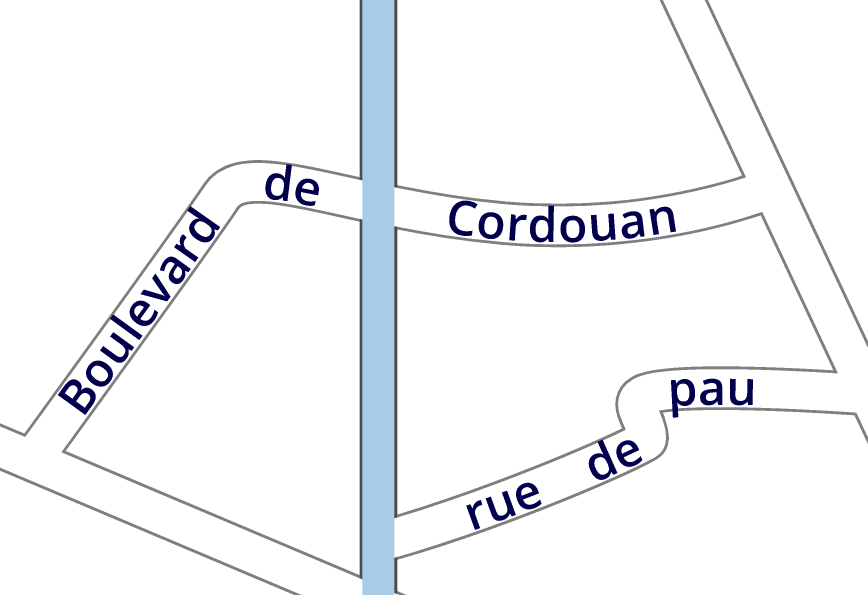
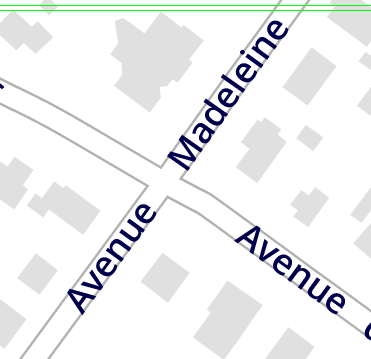
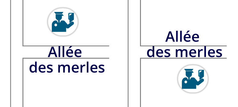
Texts will first try to avoid covering intersections, taking into account the thickness of the intersecting curves:
but they allow themselves to cover an intersection for better readability:
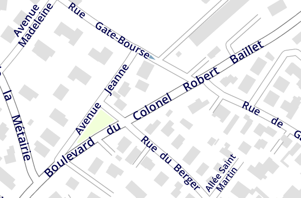
Based on all these principles, the algorithm will find the most readable placement solution by playing on gaps, repetitions and modifications on all texts to be placed.
Its goal is to place texts on all curves while minimizing transformations.
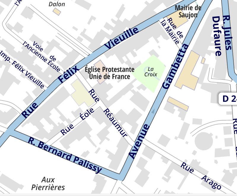
In the following example, we can identify texts abbreviated, with a font reduced, put on two lines, and combining several of these modifications, all with a harmonious distribution:
What to do in case of impossibility?
It may happen that placing a text is impossible, if the curve is too short, too twisted, in the presence of too many obstacles and often in very dense areas.
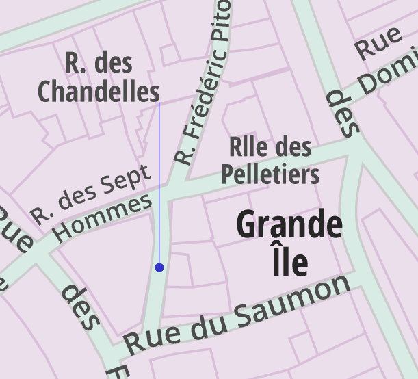
In that case, it is possible to request transforming the text into a flat text, and to place it using the powerful dedicated algorithms, optionally creating a leader line.
The other option offered is to place it as best as possible and then put it in a dedicated layer, which like all layers can be hidden. This allows the user to identify and modify or delete these texts.
Examples of 100% automatic rendering
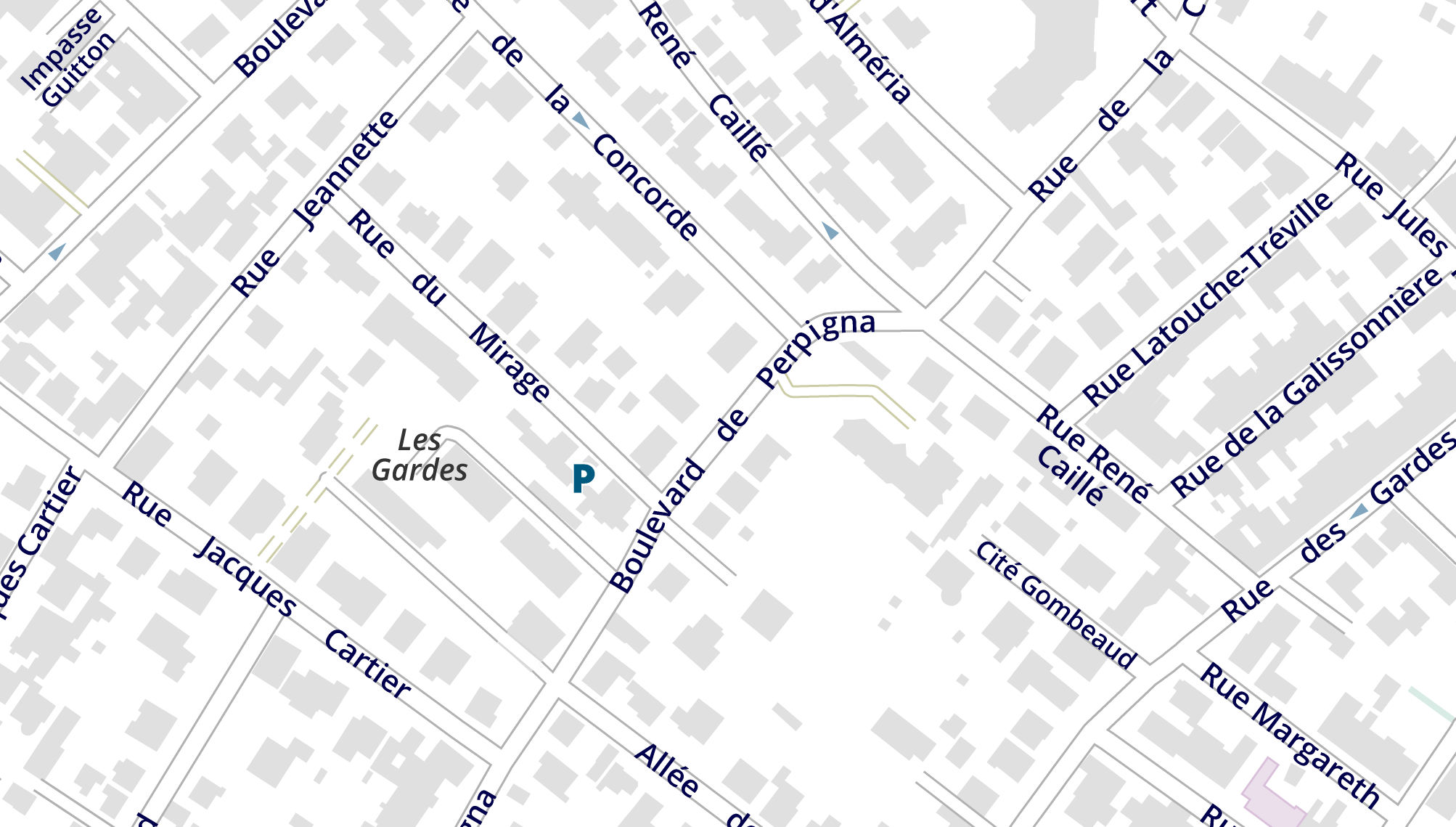
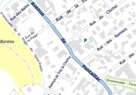
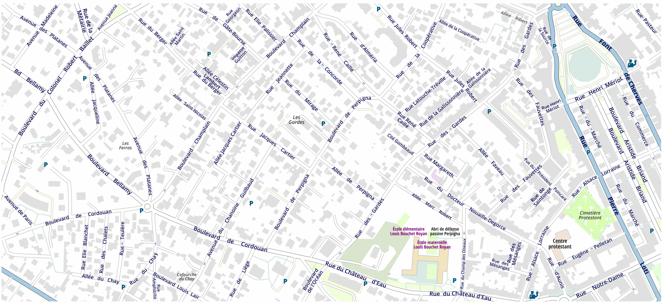
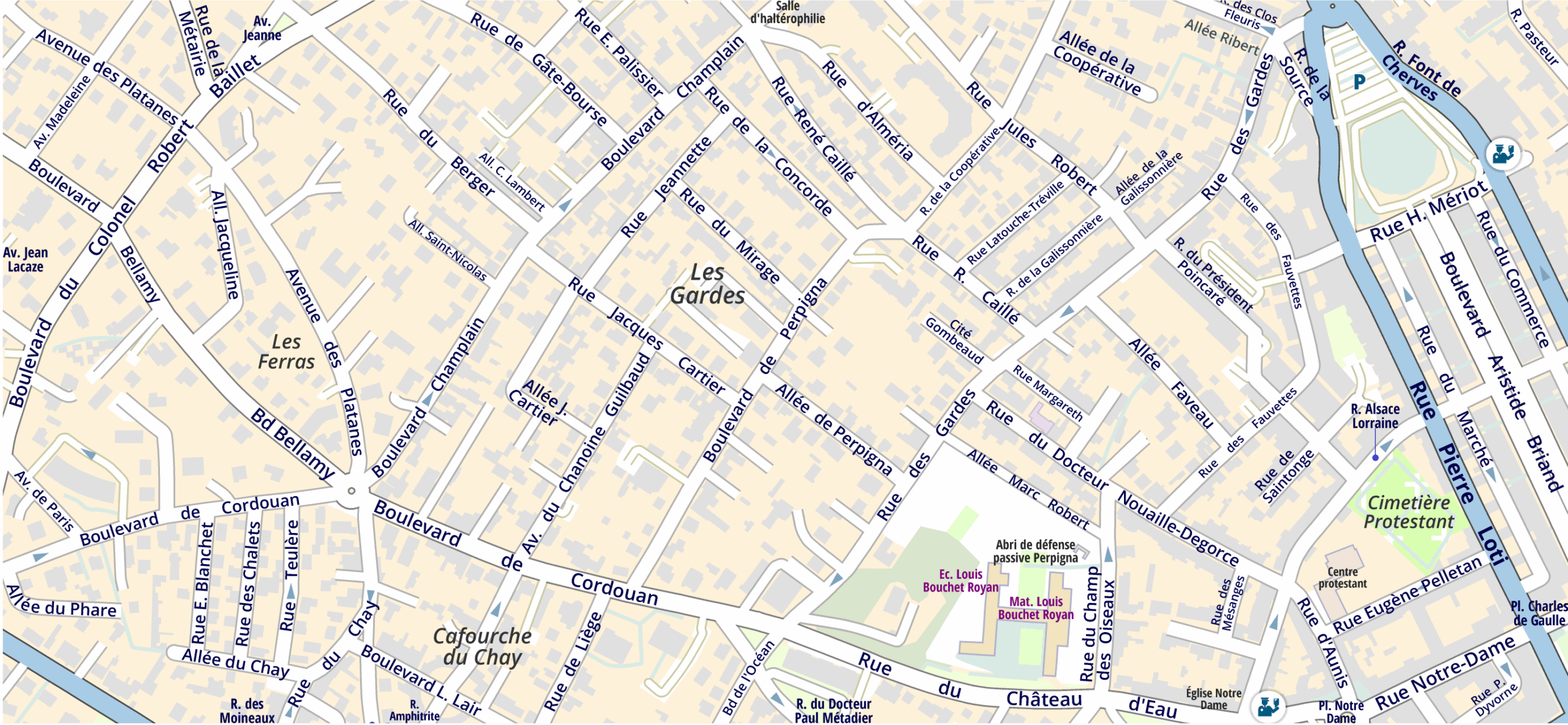
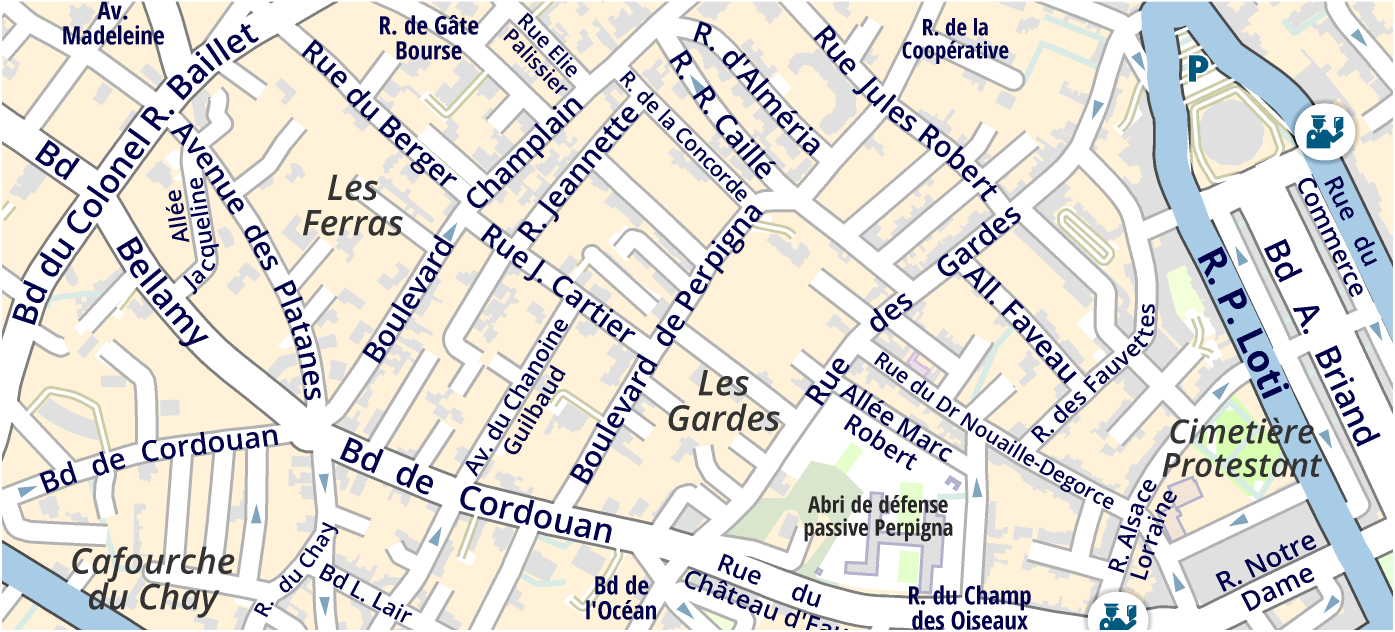
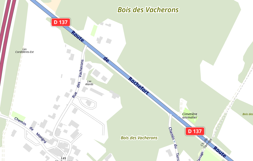
To demonstrate the power of the algorithm, here are three placements of the same area, with similar symbology, but at different scales:
1 : 2 500
1 : 5 000
1 : 10 000
